Ricochet is the best place on the internet to discuss the issues of the day, either through commenting on posts or writing your own for our active and dynamic community in a fully moderated environment. In addition, the Ricochet Audio Network offers over 50 original podcasts with new episodes released every day.

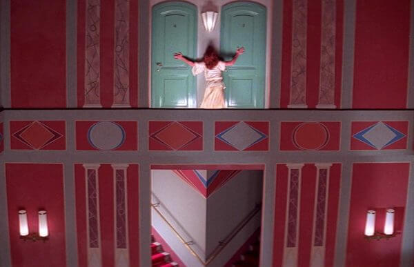
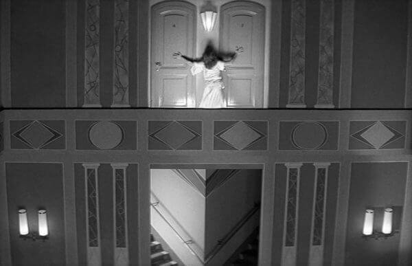
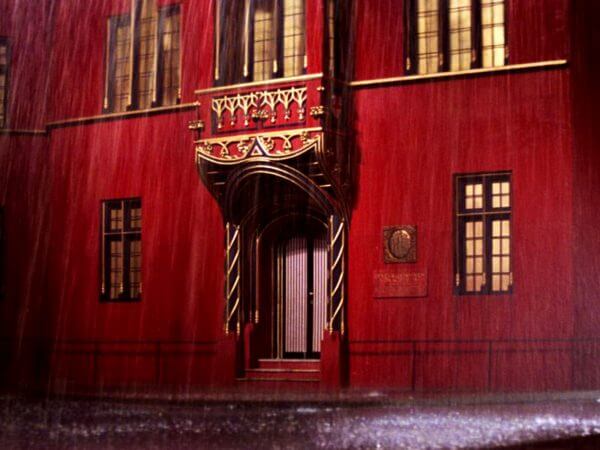
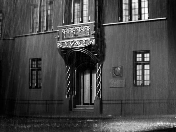
 Altered Images: Colorization
About thirty-five years ago the top bosses of my then-employer, the American Film Institute, got us into a real jam with our funders. Taking a stiff-necked, self-righteous pose, AFI impulsively issued strong statements and held an urgent press conference in support of a new artists’ rights movement headed by longtime board members and all-around AFI pals Steven Spielberg and George Lucas. Saying yes to them must have seemed like a no-brainer. What, after all, could be controversial in 1980’s Hollywood about backing Steven and George? And they had allies; the film directors’ guild, as well as groups of film critics and other intellectuals, were coming out in force against a new media technology that they sternly called a mortal threat to America’s film heritage.
The new technique, supposedly so dangerous to preserving American culture on screen, was called colorization, using video technology to allow hand-coloring of black-and-white films and TV shows. In retrospect, it was one of the most overblown film controversies of the mid-Eighties. But the way it worked out set business precedents that still guide media law to this day, and shape the battleground over censorship and online cancel culture. Withdrawing Song of the South from general circulation, or turning police guns into walkie-talkies in E.T., cutting a Donald Trump cameo appearance out of Home Alone 2 or removing Kevin Spacey from All the Money in the World, —they were all affected by what happened in courtrooms and offices in the nearly-forgotten Colorization War of now-distant 1986.
The studio bosses, the guys who in fact ultimately paid AFI’s paychecks, were solidly on the other side of this new technical issue and resented AFI’s well-intentioned meddling. Ted Turner was pissed with us, man. “They’re my movies, and I’ll do what I want with them”, he snapped. Disney and Paramount weren’t happy either. Once AFI got the word it did some frantic, face-saving back-pedaling. We hadn’t intended to bite the hand that could strangle us.
The basic idea of colorization goes back to the earliest days of film. Rows and aisles of retouching artists, generally women, sat at flat, glowing glass tables equipped with big magnifying glasses. They used sable brushes to paint colors directly onto each frame of film. It was a crude process, but it delighted the audiences of 1907. By the ‘20s, movie photography began to include color, though rarely, and the paintbrushes were put away.
The vast majority of old movies continued to be black and white until the ‘50s. Then increasing the proportion of color films gave the theater screen something that early television couldn’t compete with. By 1965, after a half-billion-dollar effort, television caught up with color, and basically everything had to be made in color from then on. That left Hollywood with a huge inventory of black and white titles, feature films, and TV series, that were now worth far less money. Film companies couldn’t sell nearly as many of the “b&w”s to local television or basic cable—almost their sole markets—as they could sell even mediocre color programming. On Mannix, they still use dial phones and record players. Every adult seems to smoke. Women wear mini-skirts. Quaint! But to casual viewers of MeTV or AntennaTV, because it’s in color it’s instantly accepted as part of our everyday world in a way that (black and white) M Squad or Peter Gunn can never be. Rapid depreciation of black and white meant less studio equity, less collateral for loans. They took the hit on their books, wrote off the loss, and moved on.
Decades later, at the dawn of the ‘80s, the studios were offered a chance at partial recoupment of that loss, at a price. New analog technology allowed video frames to be painted and stored electronically, one at a time. Emerging digital technology was capable of much more, such as auto-following a colored-in shape from frame to frame, and a more subtle, deeper color palette. The new media tech was now accompanied by one of capitalism’s most unmistakable cues, the sound of big money hitting the table.
Then the guilds threw a fit and everyone ended up in court. (Why, exactly, did the Writers Guild have any sort of standing? Did their members really think they had a legal right to have their words read aloud in black and white rather than color?)
After the expensive legal wrangling, a consensus formed around two points:
First, the big picture: The studios won, make no mistake about it. They outright own the material and can do what they want with it, provided all existing contracts are observed and all profit participants paid. The grandly European concept of artists rights beyond the contractual, the goal of the arts guilds, was largely ignored or legally rejected, though Congress did give the complainants a fig leaf to hide their defeat, a requirement that colorized video should bear a notice that the original work was in black and white.
Second, the artists lost, but the studios admitted that artists’ rights mean something, as long as that “something” was abstract and didn’t cost major money. In case of alterations of library content, whether by censorship or by more routinely commercial reasons, the studios voluntarily promised that the original version would be saved in the archives, so a decision, say, to colorize or censor, can be changed or reversed, years later. This is essentially a handshake deal. There’s no real enforcement mechanism, but nobody wants to be that one schmuck who breaks a deal and faces the wheel. As of the time you’re reading this. the original negative and soundtrack of Song of the South are sitting, peacefully intact, in Disney’s film vaults, and a few miles away in Burbank, the original B&W, non-colorized version of Yankee Doodle Dandy is kept by Warners.
That was the truce between art and commerce. That truce line assumed that artists would always be on the side of freedom, and companies would always be on the side of censorship. Bluntly, it was a parent/child relationship and for most of a century, it basically worked. The system wasn’t set up for a situation where art and commerce went to the same colleges, read the same magazines, and essentially thought alike.
So what happened to colorization? It’s there today, it works better than ever, but it’s still rarely used, even as black and white film prints—and our memories—fade. Contrary to Martin Scorsese’s fears, the studios holding rights to historically significant black and white films didn’t knock themselves out in a mad rush to offend purists by colorizing classic films that only purists would pay to see anyway.
Nobody’s even rushing to colorize classic old TV shows like The Dick Van Dyke Show, Sgt. Bilko, or The Honeymooners. Fifty, sixty years after they first aired, people know how old they are, and are accustomed to them in their original form. One minor exception has been very specific, two ABC shows of the early ‘60s, Combat! and Twelve O’ Clock High. Some episodes of both shows were colorized, the rationale being they were World War II shows with a lot of stock footage that already defined them as part of the past.
One episode of I Love Lucy has been colorized twice, giving us a look at how much the artistry behind the technology has improved. IMHO, the outstanding example of what intelligent colorization can do for a movie is They Shall Not Grow Old, which used a variety of novel techniques to turn World War I footage, and our faded memories into a new-for-the-first-time vivid sense that these weren’t mere flickering, herky-jerky shadows on the screen, but men as they actually lived, people once as real as you or me.
Make no mistake about it, turning World War One imagery into color is adding something that wasn’t there to begin with. But paradoxically, it restores an image to a lifelike, if imprecise, and better impression of reality.
Altered Images (aside from being the name of an ‘80s band) will be a short series of posts revealing how, well, motion picture images are altered, with a specific emphasis on changing reality. The next post in the series is likely to be about image smoothing, or frame rate adjustment, and why this seemingly obscure, subliminal technique is going to be important to the way we see the past. Soon we’ll get to how films as diverse as Citizen Kane, In the Line of Fire, and Zelig use these techniques on once-real, now-altered footage.
Published in General
I always thought that saying sounded better in the original Klingon.
I know it’s hammy to “Like” this comment, but how could I help it? Thanks for the kind words, iWe!
It’s OK. You deserve it.
Klingon isn’t included in Google Translate, so if you have it in the original Klingon, perhaps you could post it along with audio. I might use it in a post I was thinking about writing, in which I would compare Americans’ traditional fears of drunken Indians to the deep state’s fears of rowdy Americans, as seen in their reactions to the recent social-justice-protest-gone-bad.
I tried saying it into speech-to-text, but it couldn’t hear me, so I shouted it.
Now, all of a sudden, I’m on the bridge of a Bird of Prey star destroyer. Weird looking crowd up here.
Wow, can’t believe I’m so late to this post, another bravura piece of film history from Gary McVey. The colorization controversy reminds me of the Cleanflicks lawsuit from the 2000s. In Utah there was a movie rental store called Cleanflicks which edited the DVDs to remove offensive material (Has there ever been a more Mormon business?) which did not go over well with Hollywood. Some of the same names who opposed colorization–Spielberg, Scorsese–showed up again as defendants in the lawsuit. There’s a documentary about it that I still haven’t watched.
This seems like the best solution. Directors–artists in general, really–can be overbearing (read: annoying as hell) in protecting the sanctity of their work, which as a creative type myself I’m sympathetic to. There’s Crispin Glover’s refusal to show his films anywhere but in a theater, David Lynch’s demand that home video releases of his films not include chapters since they should be viewed as a whole, and the many writers who don’t countenance fanfiction. An acknowledgement that a work has been altered, is not “canon”, and may deviate from the artist’s vision should be an easy compromise.
Can’t think of a single colorized film I like, but I’d only get angry about it if it was the only version of the film available, which reading the comments sounds like was the case for many films/shows at the time. I’d think technology made that an obsolete concern since multiple versions can be included on one disc. But there’s still a sub/dub debate in anime and they’ve been able to include both English and Japanese tracks since the 2000s (or four English tracks in the case of The Mystery of Mamo), so if colorization becomes in vogue again, I expect the same vitriol we saw in the 80s.
Director-approved changes can be just as bad as studio ones. See: the changes made to The Evil Dead on the Blu-ray/4K release (detailed by YMS on his YouTube channel). Yeah Raimi, it was a movie you made for $350k when you were 20. It’s not perfect. That’s why we like it. Look on forums that discuss home media and you’ll find angry threads hundreds of pages long about terrible transfers approved by directors (admittedly some of these people are way too critical about this stuff; methinks the evils of DNR rank somewhat lower than the stasi).
I do want to say that aesthetically I’m more inclined toward the snobby European auteur viewpoint in that B&W feels like cinema at its purest, like the proper way to watch things. Roger Ebert, who unsurprisingly opposed colorization, admitted once that he sometimes indulged in the opposite practice: watching color films in B&W. Since modern TVs make doing so easy, a few years ago I started doing the same when rewatching my favorite films. Some movies suffer from the loss of color, a greater number are improved, and most are somewhere inbetween. In every case, I appreciate the opportunity to see familiar flicks in a new light. I tell you Alien, Hellraiser, Oldboy, Fargo, and Beetlejuice (among others) were made to be seen in the silver glow of black and white, whether or not the filmmakers realized it.
A very interesting way to re-see a movie. When I was in film school, black and white was still the norm for student films and most independent ones. Color was expensive, so everyone recreated the history of cinema by first shooting silent black and white, then black and white with a music and effects soundtrack added later in editing, then films made with actual sync sound, and in a few cases where students tossed in their own money, color. By the time we got to color (and not everyone did) some of us became pretty proficient at lighting and exposing black and white. We could wring a whole lot out of those shadows.
When or if a director or cinematographer did their first work in color, it was treated as more of a pretentious big deal than it would be now–everything in life and on screen is in color, so what’s the big deal? But in 1937 (Becky Sharp) or 1939 (Gone With the Wind) every backdrop, every costume, every hair color, literally down to lawns and trees were re-dyed or repainted to achieve certain color effects. Sergei Eisenstein had worked in theater and was used to the idea of overdramatized, symbolic, hit-you-over-the-head color, so when the Red Army dismantled an entire east German Agfa color film plant and shipped it to the USSR, he knew just what to do. He was in the middle of filming a trilogy, Ivan the Terrible. For films like this, as well as special national projects like The Battle of Berlin, most of the movie was in black and white, but certain key scenes were in color.
Digital photography today allows the same sorts of aesthetic choices. Unless you are a very rich person who deliberately buys a Leica B&W camera (yes, they do make one), your sensor always shooting in RGB – the Bayer filter makes it impossible to do otherwise – even if you are shooing in “black and white mode”. Modern cameras generate raw data files that encode far more information than a JPG can contain, and all that color data is there. This gives you the choice in post of how you “develop” the raw file for the final image.
Better still, the raw files let you control for exposure and contrast, which gives you a surprising amount of control over how shadows appear. These here were shot in color, but in color they actually lost a lot of context. Strip the color out and they make much more sense.
And sometimes it wasn’t even an artistic choice. I grew up watching Star Trek in reruns, so I never really gave any thought to why it looked the way it did. It wasn’t until much later that I read about how NBC (owned by RCA, which wanted to sell color TVs) influenced the design of that show in ways that would maximize its use of color. That’s why the Starfleet uniforms were in those striking primary colors, and it’s why (especially in earlier episodes) the walls of the sets were often lit with multicolored lights for no discernible reason.
Back in the 1980’s we visited Color Systems Technology in the Marina, where an acquaintance of my wife happened to work. They did the MGM stuff for Turner. Turns out much of the actual colorizing was done by young film school types. One of them was tasked with colorizing an old Frank Sinatra movie. The result? Old brown eyes.
The technology has certainly improved and become democratized. There’s a YouTube video restorer called NASS who puts up colorized home movie period street footage (with an honest disclaimer also covering manufactured sound effects.) I recommend it.
I love that channel.
Here’s a recent (and IMHO, excellent) colorization done on a short clip of a snowball fight in 1897. When the technique is at its best, it gives the rare gift of near-time travel; this is what you’d have seen if you were standing on a street corner, 124 years ago.
https://www.nytimes.com/2020/11/05/magazine/snowball-video-fight.html
The clip has had several other technical corrections applied, and that’ll be the subject of the next Alt Images post.
Movies that were intentionally colorized from the get-go as an artistic decision are cool. As far as I’ve seen, they don’t even attempt a natural look, but tend toward tinting the entire frame for dramatic effect. Last year I saw the incredible Häxan: Witchcraft Through the Ages which has scenes like this:
Also saw The Cabinet of Dr. Caligari which is likewise tinted monochromatically:
There are contemporary directors who use the technique as well. Guy Maddin is fond of making films evoking eras of film long forgotten. His 1992 picture Careful doesn’t just use monochrome tinting like the above two, but also embraces the unnatural and garish look of more traditional colorization:
Ah, Maddin. I really need to see more of his stuff–only watched this and The Saddest Music in the World. Lynch is often described as the weirdest director, but Maddin shows he’s the tip of the iceberg.
In the 60s when Andrei Tarkovsky was filming Solaris, color film was expensive in Russia and not enough was available to do the whole movie , so he used it for some parts and others were in black-and-white. He tried to make some meaning out of the difference, but sometimes he had no choice but to use what film was on hand at the time he was shooting. So his “meaning” is somewhat garbled.
(I’ve watched the film several times.)
That’s fantastic. Was not expecting them to be adults.
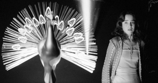
I’ve seen this pic floating around. It makes me think Suspiria might be mindblowing in B&W even though its colors are so integral to its power. Let’s do a quick experiment.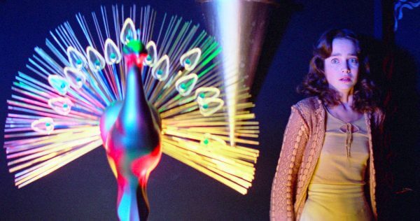
 Yeah, it would look amazing. Will have to watch it sometime. Thank god Synapse released it on 4K.
Sadly, I also just found out all the top image results for Suspiria are from the remake. We truly live in dark times.
The silents had two distinct processes that could be used at the same time, tinting (coloring the bright parts of the picture) and toning (coloring in the dark parts). There were six colors of chemical treatments to choose from IIRC, and some were so effective they were used in many different films of the teens and twenties. Especially effective: dawns and sunsets, a subtle mixture of pink and blue. Mountains. Ocean waves breaking on rocks. Romantic scenes were particularly prone to shades of scandalous pink and purple.
Those particular scenes were cut out of the finished film print and then spliced back in after their color treatment was dry. There was no way to copy the films like that; every single release print had to be treated individually. The chemical treatments weren’t compatible with the sacrosanct black and white-ness of a soundtrack running to the side of the picture, so the technique didn’t survive the onset of the talkies.
Lindsay Anderson’s If (1968) has black and white scenes whose meaning was over-analyzed in its day. I met Anderson in 1973 and he laughed about it. The reason was pretty prosaic: they were filming at venerable old college locations, and the campus wouldn’t let them bring in anywhere near the amount of light they’d have needed for color. That was the old Eastman 35mm stock, 5251.
It’s amazing all the stuff I learn from people on this site. I do remember reading that the restoration of the two films I mentioned faced difficulty in determining what shades of tint/tone should be used. If each print was colored individually and those that survived probably faded or got discolored, then it must involve some guesswork. I think they pulled it off splendidly.