Ricochet is the best place on the internet to discuss the issues of the day, either through commenting on posts or writing your own for our active and dynamic community in a fully moderated environment. In addition, the Ricochet Audio Network offers over 50 original podcasts with new episodes released every day.
 Predicting Elections Using A.I. and Machine Learning
Here’s a set of stats from the 2016 election you may not know:
- Trump received 2 million more votes than Governor Romney.
- Hillary Clinton received 62K fewer votes than President Obama.
Obviously, a shift happened over four years which favored Donald Trump. Which demographic factors motivated that shift? More importantly, is there something we can project for the 2018 and 2020 elections?
Using data from Kaggle, we can identify key characteristics of each county for all sorts of interesting comparisons. Let’s get science-y and use machine learning to identify the top county-level demographic trends which might have predicted a Trump victory.
My theory is pretty simple. The biggest determinate in the 2016 election was the dramatic burst of votes that Donald Trump received compared to Gov. Romney’s totals in 2012. (Note: I worked as a digital director on the Romney campaign in 2012).
Using Artificial Intelligence and Machine Learning tools, we can uncover some characteristics and extrapolate what it means for November 2018 and 2010. The demographics we’re using denote population range, population shifts, age range, race, education, work type, economic status, home ownership, commercial business stats, and geographic area.
Trump vs. Romney
First, let’s use machine learning to predict which county demographic factors were most important in determining which counties Trump did better than Romney. In other words, who were these 2 million voters who came out of the woodwork for Trump?
As mentioned above, Trump bested Romney’s vote totals in 2,561 counties.
Running an ensemble machine-learning model from my favorite UI-based tool BigML.com, I found that the following stats were vital in predicting a Trump boost over Romney county vote counts:
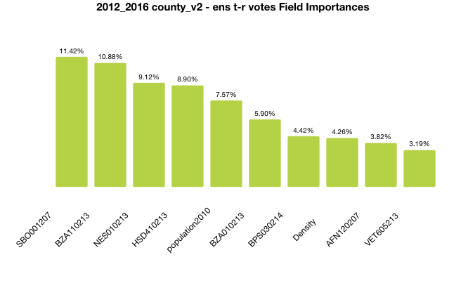
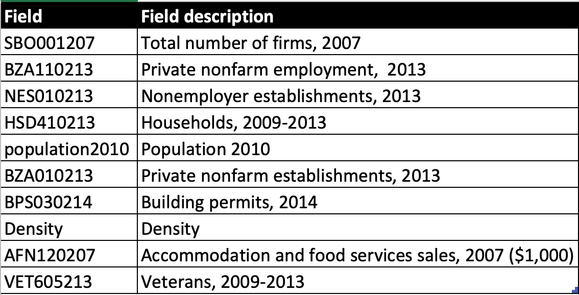
Let’s translate those top codes:
As you can see, the key factors determining a 2016 boost for Trump over Romney are centered very much around economic demographics.
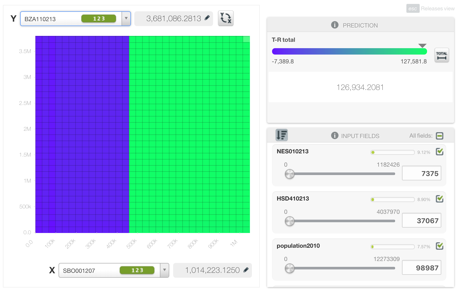
For example, we can put the first two factors on a correlation grid and see that as the “Total number of firms, 2007” increases with “Private nonfarm employment, 2013” the likelihood of a larger vote difference between Trump and Romney increased:
As pollsters and strategists target various states, congressional districts, and counties they look for momentum swings and previous vote tallies to help guide their efforts in winning elections.
A vote for Trump is not necessarily a vote for your candidate (Republican or Democrat) but the demographic factors imply some movement for specific issues.
In my next article, I’ll map these to the key swing congressional districts and see if we can predict some outcomes.
Published in Elections
Very simple.
Trump brought in Democrats and folks who never voted before.
Hillary had all the appeal of a nagging mother-in-law with herpes . . .