Ricochet is the best place on the internet to discuss the issues of the day, either through commenting on posts or writing your own for our active and dynamic community in a fully moderated environment. In addition, the Ricochet Audio Network offers over 50 original podcasts with new episodes released every day.
 Sunday Aesthetics: The Good, the Bad, and the Ugly
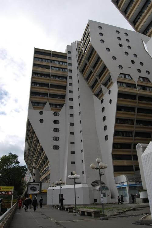
Consider this building–Building A, for our purposes:
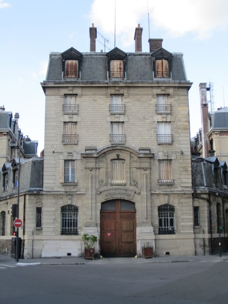
And now, consider Building B:
One of the great solaces of Ricochet is that I will not have to persuade anyone here–I hope–that the second is in fact more beautiful than the first, and that to say so is to say something more interesting than, “I like the second one better, although they’re both equally beautiful because of course that’s all relative.”
Nor do I think I’ll have much difficulty in persuading people to take seriously the idea that beauty–as an objective, external reality, perhaps even a Platonic one–may well be connected, in an important way, to moral goodness. (I may have trouble convincing some people here that this is so, but I’ll bet you’ll take it seriously, as an idea.)
I have lots more about this to say, as you may have guessed. But it’s still too fuzzy. I’d like to translate my broad intuitions about this into a very defensible argument, and for that, I need a robust theory of aesthetics. To my surprise, though, I’m finding the philosophical literature less helpful than I would wish. Perhaps I’m not looking in the right places?
So: can anyone suggest interesting ways to look at the following ten questions? (I think I can handle some of them quite well, but I’ll hold fire for now.)
- Why exactly is Building B more beautiful than Building A?
- Assuming that we have good answers to question 1), do they suggest principles that may be broadly applied to all buildings?
- Assuming the answer to 2) is yes, does this suggest principles that may broadly be applied to the idea of “beauty?”
- What are your intuitions about the connection between “the beautiful” and “the morally good,” particularly in this context? And 4a): What are your arguments, as opposed to your intutions?
- What are your intuitions about what it might do to human societies, morally, if they start constructing many more things that in terms of beauty are far closer to A than to B? And 5b): See 4a.
- Looking at 5) from a different angle, what are your intuitions about what might be going on, morally, when a given society begins to think it’s a good idea to build many more A-like buildings than B-like ones?
- Can you back up those intuitions with evidence?
- What, for that matter, would constitute “evidence?”
- If your intuition or answer thus far involves, “something morally bad is probably happening when the As start vastly exceeding the Bs,” can you rule out–with sound arguments, and even better, evidence–a response such as, “the answer here is less importantly connected to beauty and goodness than it is to changes in building technology and economics?” (I mean the latter in the sense of, “It costs less to build something like A.”)
- To which philosophers–particularly those who focus on aesthetics–would you turn in thinking through this problem?
Now, some special rules. To make this more fun and challenging for James Gawson, he, in particular, is not allowed to mention this. Others are however allowed and encouraged. To make this more fun and challenging for Gödel’s Ghost–and yes he is among us, apparently–he is not allowed to mention Moles, Nake, or Schmidhumer. Others are however allowed and encouraged. To make this more fun and challenging for us all, everyone is encouraged to see whether he or she can with a straight face and in all seriousness include a genuinely useful thought from a philosopher in the school of Derrida. And to make everyone stop laughing themselves half to death once they’ve tried that, I suggest a quick review of Vitruvius. That will sober you up right fast.
Published in General
Oh, gosh. Given that I lived from ages 2-21 in Columbus, Indiana, I’m tempted to disqualify myself.
I asked my daughter – age 7 and a lover of art (Rouault’s The Old King is a favorite) – question #1.
She likes B. She just likes the whole thing. She doesn’t know why. She doesn’t like the squiggly parts at the top of A.
My interpretation of this is that B works as one whole unit. A appears as a symmetrical assembly of matching parts.
I’m just a simple guy with a background in economics, but I think it comes down to building B is pre-WWII and building A is post WWII. After WWII it became all about the architect and “making a statement”. Before WWII it was about creating something generations could enjoy. Obviously, this is a generalization….yes, they did make ugly buildings before WWII and yes, they did make some nice buildings after WWII. However, I wager you show a kid (kid only because this is pre brain washing) and 9 times out of 10 he/she would say the pre WWII building is better.
Mumble grumble Louis Sullivan fume froth Bauhaus gritch groan non-representational art.
Building B represents the end product of many hundreds of years of people working with its basic materials, techniques, and parameters (size, etc.). It was a mature technology.
Building A did not have such a heritage. Perhaps that was why the architects had so much freedom to screw up. Buildings from the 1950s became dated and ugly almost as soon as completed. Buildings from the 1960s became dated soon but held off the ugliness a bit longer. Buildings from the 1980s have held up much better on both counts. In 2014, architects have more history to have learned from.
CT – Granted, but why did Building A not have a heritage? It’s not like the reset button was pressed on building knowledge in 1950. Civilization rebuilt beautiful classical buildings after WWII after they were destroyed. Why did the new buildings have to become monstrosities?
Building B looks crafted. Building A looks manufactured. A is an Ikea building – functional, probably relatively cheap, with a glancing nod to aesthetics.
Craftsmanship lasts generations, and doesn’t go out of “style”, if that makes sense. From an impression point of view, one of the two buildings makes one. The other building disappears into the background.
I imagine that walking past the two buildings would have that same effect. One building would draw the eye to the details of the stonework on the facade, and prompts the questions about its history, who lived there, etc. Ikea building prompts exactly zero from me.
Claire is (it seems to me) asking about architecture as propaganda. This may seem lunatic, but she’s not the first to do so.
Claire,
I will start from your last question first. Kant wrote The Critique of Judgement as his third major work after The Critique of Pure Reason and The Critique of Practical Reason. It is entirely about aesthetics.
The first works are important because one must first understand that for Kant morality is fully deontological and thus explicitly objectively rational. However, its ground is transcendental and can not be observed through our senses. What can be observed through the senses is aesthetic taste. For Kant there are two aesthetic principles of taste, beauty and sublimity.
As morality is explicitly objectively rational the judgement of taste is the subjective external observation of morality. In other words both the beautiful and the sublime are the moral subjectively perceived.
The Beautiful is morality subjectively perceived through form. The Sublime is morality subjectively perceived through formlessness. In addition to this a feeling of pleasure accompanies the observation of both the beautiful and the sublime. This pleasure must accompany the form or the formless as a representation. Pleasure derived from direct contact is not aesthetic pleasure but sensuous pleasure. If we get pleasure through the form of the building (only) then we make the judgement that the building is beautiful. If we were to get pleasure say from the formless (only) demolition of the building (a very odd pleasure indeed) then we could say that the demolition of the building was sublime in its formlessness.
The judgement of taste must be subjective. Meaning that no explanation accompanies the representation. You observe a representation of an object you derive the pleasure and you ascribe the pleasure to the observation. Now because there is presumed to be a common sense in humans the judgement of taste should be universal. All humans will think it beautiful or sublime. One could only come to this conclusion if one believed in a fully deontological morality that was a prioi to all.
Yes, I would call the first building goofy modern. The second building, although a little worse for the wear, has a quiet dignity. It is more sublime than purely beautiful. If restored to full adornment then it would be quite beautiful also.
Regards,
Jim
Great answer.
Building B is more beautiful because it is built on a human scale. It also echoes, in an attenuated way, the biological forms with which we are intimately familiar: it has a base, a middle and a top, like a tree or a human body.
I am a software engineer, not an architect, but to me Building A violates two design principles:
Prince Charles was right about architecture.
Actually I think research shows that there is an objective standard to what humans find appealing. It is a limited standard, so don’t read too much into it. But, symmetry plays a very big factor in our evaluations of beauty. Whether we are evaluating other people or objects. Building B is highly symmetrical, while building A is not, at least not from the angle it is presented. Why is it that we find symmetry so appealing?
I would guess it is because symmetry conforms to our brains expectations. Nature is filled with symmetries and patterns which our brain recognizes and process subconsciously creating expectations. When those expectations are not met our brain actively notes it and we become more alert and stressed or maybe confused Symmetry is comforting and we enjoy comfort. This is why when artists or architects wish to shock people they turn to asymmetrical or patterned work.
Of course what I lay out here is rather materialistic, and I don’t really wish to imply that this is all there is to it, but I think it is a factor. The question then becomes once you remove symmetry from the equation do other things inherently stick out? IS the Taj Mahal more or less beautiful than the Great Pyramid at Giza? They are radically different buildings, constructed by very different cultures at very different times. They there could be no two buildings more distinct, but is one really more beautiful?
Frankly while I love the look of many old buildings, I must say the modernist steel and glass construction of the more recent metropolitan cities is breathtaking. Large shiny geometric buildings reflecting the sun in a hundred ways, that light up at night I think is utterly amazing.
One way to think of this is that a person could walk miles amidst buildings B without ever feeling alienated or oppressed. B suggests home and settlement. B could be a home or office without spoiling its simple beauty. A beauty of the heart.
Could anyone walk through a mile of As and feel that same sense of belongingness (I’m not sure that’s a word)? A, with its overhanging arches and sterile lines does not invite. Instead, it demands a type of obedience by shutting out the person and recreating him as a cog. Personally, though I know many cities have more and more As, such “architecture” has reduced those cities to machines. A suggests conformity–in fact demands it.
B invites persons–each person–and seems to welcome all who come near provided they agree to treat B, and those who occupy B, as a community of free individuals.
You can’t really dream in A. Nor can you be at peace.
I have great respect for Roger Scruton, who has written extensively on architecture, art, literature, etc., all with the aim of returning to beauty, which requires an understanding of the truly human that has been lost in modernism. Here’sa brief video:
Building B was built to house rich people, and Building A was built to house the poor. Of course Building B looks nicer – I believe ‘crafted’ has been used to describe it – because more was spent, per beneficiary, constructing it.
(Assuming A is housing. Of course.)
If building A was built to house the poor then it is quite nearly a crime against them. Cardinal Newman said that the poor need beauty as well as food. A is about as devoid of beauty as can be imagined.
Too easy: Building B is designed using the Golden Mean to arrive at it’s proportions. The best book on the use of these proportions is still “The Geometry of Art and Life” by Matilia Ghyka, published in 1977. http://www.amazon.com/exec/obidos/ASIN/0486235424/phipoint-20
-I’ve worn 2 copies thread bare since I first came across it in the early 1980’s.-
Here is my thinking on aesthetics:This Artist’s Creed:
1. The fundamental elements of art are perennial.
2. Precedence, fame, style and influence are irrelevant to aesthetics.
3. Gender, sexuality, race, ethnicity, origin, spirituality, temperament et al, are incidental to the merits of the work itself.
4. The concepts, idea, explanation, rational, novelty and/or intent are subservient to the potency of the work.
5. The artists’ hand is vital.
6. Work that intentionally harms, encourages the harm, or celebrates the harm of a sentient being is not Fine Art.
7. Place, time, experience and inward emotional texture transmuted through a rich interior life are the heart of the Arts.
8. Media, technology, technique and process are means, not the end.
9. Politics are transient… Art remains.
10. Integrity, humility, curiosity, and consistent, honest effort are the artists’ best route to acquiring the necessary knowledge, understanding and craft.
11. The Arts’ ancient resonance speaks from our most inward, unique, yet universal living language (the mammalian prime language) whose foundations we each build upon from our earliest and inmost experience.
12. Aesthetic beauty lies in the skillful construction of harmonic balance… wherein is allowed to creep the craven trespass of ecstatic passion. In a masterpiece this tincture is then held in an ever so tenuous, sacred pause… which we can never forget.
All rights reserved by F. A. Alsbach
Sorry I seem to have screwed up the spacing.
Buildings in the past looked the way they did largely for practical engineering and economic reasons.
The building materials are generally chosen because they are abundant near the construction site. The architectural flourishes generally have practical uses, such as how the purpose of gargoyles is to direct water away from the building, thereby reducing erosion to the stonework.
These building materials and architecture-by-necessity allowed for a fair bit of variety in how buildings were designed.
Over time, as engineering processes became more advanced and different building materials became cheaper, stronger, and more energy efficient, the “ideal” practical design of a building became more standardized and featureless.
I mean, really, you cannot get more practically useful than a big steel & glass rectangular prism.
But, architects need to be artistes. If every building is a big steel & glass rectangular prism, there’s not much need for architects.
As such, nearly any time an architect designs something “different”, it’s actually a departure from the practical “ideal”. They’re making the building less useful just for the sake of being “different”.
Now, architects can go “retro” and try to emulate the older styles. The problem there is that those architectural flourishes and building materials are no longer necessary, the buildings end up looking rather fake, and impractical.
Look at Building B. It “looks nice” from the outside, but think about how small those windows are compared to modern buildings. If a developer tried to build an apartment building today with windows that small it would result in bankruptcy.
Much of Ottawa’s official architecture suffers from this. New buildings are designed to look sorta kinda like the neo-gothic architecture of the Parliament Buildings, with fake dormers and roofs painted green (to emulate the copper roofs of Parliament).
It’s especially silly since, as the Centre Block was built in 1918, it was fake architecture in the first place! There was no practical reason for the building to look the way it does. It’s a steel framed building with a stone exterior to make it look older than it really is.
It’s also why nearly all new cars look the same, except for the few that are phenomenally ugly. Over time, automotive engineers have figured out that there’s pretty much a single “ideal” shape for a car if you want to maximize aerodynamics, interior space, and safety. i.e. the “egg” shape.
Since people get tired of seeing the same design over and over again, the only way car designers can do anything “different” is to make a car that is less practical. The only way to be different is to be “worse”.
Like Ottawa’s architecture, the only other solution is to go “retro”, with new cars designed to look sorta kinda like the classic cars of one’s youth. These end up looking rather silly.
After WW2, few buildings were rebuilt and at great cost.
More were replaced with buildings with more modern construction.
Travel between London and Paris and you will see the difference. Much of London is poorly patched pre-war buildings mixed with hideous immediate post-war construction. Only a few places like Parliament were properly reconstructed. Paris was largely unscathed.
WW2 meant several things. There were new materials and techniques, most of which had just begun to be explored before the war. Building B was likely built with techniques and materials hundreds of years old.
Also, the extreme post-war demand would have outstripped supply of traditional materials and associated skilled labor.
You just summed up everything Frank Gehry ever built.
A was subsidized, B was not.
It appears to me that the building is perfectly symmetrical and balanced. (Speaking for myself now, not my daughter.)
Symmetry alone is not enough.
Think of lying beneath a tall oak tree. The trunk rises from the earth and flows upward toward the sky. As you look up, the trunk appears to get ever smaller. Meanwhile, the branches stretch outward into a chaotic but balanced explosion of green. Think of a flower, a mushroom, a man with a hat… there’s something natural in that.
Look at building A. There’s an attempt to replicate that. The center/corner flows upward like a tree trunk. The structure explodes outward. But it’s off. The explosion begins at the base rather than emerging from a disappearing trunk.
Then the material itself is all wrong. The white of the building does not branch out from the trunk. Rather, it is suddenly chopped to reveal brown. It looks like a tree that was sliced to protect telephone wires.
The second is not perfectly symmetrical at all. See the chimney top right. But it is in natural proportion. It flows from ground to sky. The third chimney throws off the perfection to give it a natural character.
You see, I think that’s the thing. The shapes of nature please us. The closer something is to the natural order, the more it pleases us. Or perhaps even further, the object must fit in to its place in the world.
A building must look as if it belongs there. It was always there. It will always be there. Wrigley Field, Camden Yards, PNC Park look like they belong while Dodger Stadium does not.
Or even take Girl with a Pearl Earring. Black background, timeless face, a meaningful yet widely applicable expression. That girl reaches you wherever you are whenever you are. Astonishingly beautiful.
Claire, invite James of England into this conversation. JoE can mention Derrida with a straight face.
Claire,
I didn’t see the special rules! OK OK I should read the fine print but am I supposed to assume that I am personally the target of a special rule. Actually, I like my comment very much. It is perfectly alright that everyone else just ignores it. I enjoyed it. Hah!
I never liked architecture anyway. I was meant for the stage. In fact I should have been a “Master Thesbian”. HAH!
Acting school from Gregory Mate on Vimeo.
Regards,
Jim
On the other hand…
A quick reminder that not all modern architecture is bad. Though, to be fair, this glass chapel in the middle of Nebraska contains many traditional elements. I particularly enjoy how the interlacing arches resemble Eucharistic wheat waving in a prairie wind.
Scruton’s lengthy discussion at London School of Economics — “Architecture and Happiness” — is also not to be missed.
While your comment is great (and genuinely helpful to me, thank you!)–“too easy” these questions are not. They’re really very hard. I’ve left out some of the immediate political context of this question–in the spirit of fun and to give you all a chance to say what you think without first hearing what I think. All will be revealed in time, But if only people found it easy clearly and compellingly to say and argue, “no way” to the people who tell them “Building A is excellent and good for you and we’re going to give it to you and you’ll like it, so eat it and shut up.”